
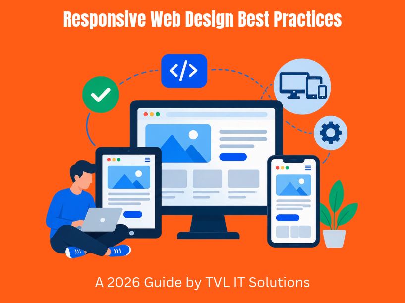

Mobile devices overtook desktop as the primary way people access the internet around 2016, and that gap keeps widening. As of Q1 2026, mobile accounts for roughly 52.3% of all website traffic globally-climbing past 72% in regions like Asia and Africa. Users expect every site to work flawlessly on the device in their hand, whether that’s a 360px-wide phone or a 2560px ultrawide monitor.
Responsive web design solves this by delivering one codebase that adapts smoothly across phones, tablets, laptops, and large displays-eliminating the need for separate m-dot sites. Implementing responsive web design ensures websites perform well across all devices, resulting in higher mobile conversion rates, stronger SEO through Google’s mobile-first indexing, and improved accessibility for every visitor.
TVL IT Solutions is an India-based custom software and web development partner that ships responsive, secure, and scalable applications for startups, SMEs, and enterprises worldwide. This guide covers everything web developers need to build responsive websites in 2026: core principles, mobile-first strategy, modern CSS layout, performance, accessibility, testing, and implementation best practices.
Responsive design adapts layouts to any screen size using three foundational pillars: fluid grids, flexible images, and css media queries. Ethan Marcotte coined “responsive design” in 2010, formalizing these core principles into a unified approach that replaced rigid 960px layouts. Before that, web pages broke badly on early iPhones and Android devices because fixed pixel widths couldn’t accommodate the new diversity of screen sizes.
Fluid grids use relative units like percentages, fr units, or viewport width values for layout columns and gaps. Instead of a column locked at 300px, a fluid column might occupy 33% of the available space, expanding and contracting with the browser window. This prevents horizontal scrolling entirely.
Flexible images (also called fluid images) scale down to fit their container’s width. Setting max-width: 100% on images ensures they never overflow their parent element while maintaining their aspect ratio.
Media queries allow CSS rules based on device width, height, or orientation. They let you define media query breakpoints-thresholds where layout, font size, or spacing shift to match the viewport. The viewport meta tag is essential for responsive design because it tells mobile browsers to render the page at the device’s width rather than a default desktop viewport.
Responsive web design differs from adaptive design in one critical way: responsive layouts scale fluidly and continuously, while adaptive design switches between a few fixed layout versions. Responsive is more future-proof; adaptive offers tighter control in narrow use cases.
Google uses mobile-first indexing for site rankings, meaning your mobile version is what gets crawled and evaluated first. If your mobile site lacks content or functionality present on desktop, your search visibility suffers. Mobile first design prioritizes mobile layouts before larger screens-and this has been the standard approach since Google completed its indexing rollout between 2018 and 2020.
Mobile-first design starts with the smallest viewport first (around 320–360px) and progressively enhances for tablets and desktops using min-width media queries. Designing mobile-first enhances user experience across devices because it forces you to focus on what actually matters. The result: mobile-first design leads to cleaner, faster layouts.
Here’s a concrete example. A product page wireframe begins as a single column on a 360px phone:
At ~768px, expand to two columns (image alongside description). At ~1024px and above, introduce a third column for related products or a sidebar.
For smaller screens, use progressive disclosure patterns-accordions, tabs, and “show more” links-to handle secondary content without overloading mobile users. Place interactive elements within the lower half of the screen for thumb-friendly reach, especially primary CTAs and navigation triggers.
At TVL IT Solutions, B2B SaaS dashboards and marketing sites for startups always begin with mobile wireframes. This mobile first approach ensures core journeys (login, KPI overview, lead capture) work on mobile phones before the team layers on complexity for desktop users.
Modern responsive sites use CSS Grid and Flexbox instead of float-based 12-column frameworks. CSS Grid and Flexbox simplify creating fluid grids, and together they handle virtually every layout challenge you’ll encounter.
Flexbox excels at one-dimensional layouts. Use it for nav bars, button groups, and horizontal card lists that wrap into vertical stacks on smaller screens. Set flex-wrap: wrap and let items reflow naturally as browser width changes. Avoid deeply nested flex containers-each wrapper adds rendering cost.
CSS Grid handles two-dimensional layout problems: dashboards with sidebars, multi-column footers, and responsive card grids. A practical pattern uses grid-template-columns: repeat(auto-fit, minmax(280px, 1fr)) to create layouts where cards reflow automatically. Fluid grids adapt layouts without media queries when you leverage auto-fit and minmax() this way.
A concrete example of a multiple column layout:
| Screen Width | Columns | Technique |
| Above 1024px | 3 columns | CSS Grid with fr units |
| 768px–1024px | 2 columns | Media query adjusts grid template columns |
| Below 480px | 1 column | Single-column stack |
Fluid grids use relative units for layout columns-percentages, fr, or vw-so you should avoid fixed pixel widths in layouts to ensure adaptability across screen sizes. Research shows transitioning from float-based frameworks to css grid can yield up to 18% faster page rendering on typical dashboard layouts.
TVL IT Solutions typically uses CSS Grid for content-heavy marketing pages and Flexbox for component-level alignment in frontend development projects, keeping layout code modular and maintainable.
Images and video are often the heaviest assets on any page. If not handled responsively, they break layouts and crush mobile performance.
The baseline CSS pattern for fluid images is simple: set max-width to 100% and height: auto so images scale down but never exceed their container. Always include width and height attributes for images-this lets the browser reserve space before the image loads, preventing cumulative layout shift.
Use srcset and sizes for appropriately sized images so mobile devices download a 480px variant instead of a 1440px desktop hero image:
<img srcset=”hero-480.jpg 480w, hero-960.jpg 960w, hero-1440.jpg 1440w”
sizes=”(max-width:600px) 100vw, 50vw”
width=”1440″ height=”810″
alt=”Product dashboard showing responsive analytics view”>
Use modern formats like WebP or AVIF for images. Core Web Vitals data from mid-2026 shows that roughly 49.6% of LCP images are still JPEG, while WebP sits at ~26.6% and AVIF at ~6.1%. Sites using newer formats consistently report better LCP scores.
For responsive video, apply the CSS aspect-ratio property (or the older padding-top percentage hack) to embedded YouTube or Vimeo players so they scale without overflow on narrow screens. SVGs remain ideal for logos and icons-they scale without quality loss at any resolution and are easily styled with CSS, making them visually appealing on high-DPI mobile browsers.
Landscape orientation images deserve special attention: a wide hero image that looks great on desktop can dominate half the screen real estate on a phone held upright. Consider art-directing different crops via the <picture> element.
Media queries allow you to apply CSS rules based on device width, orientation, resolution, and other features. The term “media queries” was coined in 2010 by Ethan Marcotte as part of his responsive web design framework, and they remain the backbone of responsive sites today.
A mobile first approach uses min-width queries, where the base CSS serves phones and enhancements layer on as screen width grows. The opposite-max-width-works for desktop-first projects but is harder to maintain long-term.
Content-based breakpoints should be established at natural points of layout adjustment. Breakpoints should be defined where content starts to break-not where a specific phone model happens to land. That said, common starting breakpoints are 360px, 768px, and 1024px, which align with popular device types:
Use relative units for defining media query breakpoints where possible (e.g., em-based queries). Media queries can target device features like orientation and resolution, so you can adjust image crops or collapse sidebars when a tablet switches to landscape orientation.
Newer media features like prefers-reduced-motion and prefers-contrast let you respect user accessibility preferences within your responsive design process. Keep breakpoints minimal: every breakpoint is code to test and maintain.
Teams at TVL IT Solutions keep breakpoint tokens (sm, md, lg, xl) consistent across design systems so components behave predictably across every project.
Responsive design is not just layout. Responsive typography adjusts font sizes based on screen size, and it directly affects whether visitors read your content or bounce.
Ideal line length sits between 45–80 characters. When as screen size decreases, line length naturally shortens. On wide monitors, unconstrained text can stretch past 120 characters per line, degrading readability. Apply a max-width on content containers (around 70ch) to keep lines comfortable for desktop users.
Use relative units like rem and em for font sizes and spacing instead of absolute units like px. This ensures text scales with user preferences and browser zoom. Viewport units like vw can create responsive typography, but the clamp() function allows fluid typography scaling between sizes with more control:
h1 { font-size: clamp(1.8rem, 2.5vw + 1rem, 3.2rem); }
body { font-size: clamp(1rem, 1vw + 0.75rem, 1.25rem); }
This scales headings and body text smoothly from mobile to desktop without a single media query. Responsive typography enhances readability across various devices when paired with appropriate line-height adjustments-tighter on mobile for reduced scroll fatigue, more generous on larger screens for breathing room.
For non-Latin scripts (CJK, Arabic, Devanagari), character density varies significantly. Global products need explicit line-height and font size tuning per language.
In B2B SaaS dashboards, data tables, charts, and code snippets must remain legible on everything from a 13-inch laptop to a compressed mobile view. TVL IT Solutions often prototypes these states explicitly during design to catch readability issues early.
Navigation must shift behavior between desktop (wide, hover-friendly) and mobile (narrow, touch-first). What works with a mouse pointer on a desktop browser rarely works under a thumb on a phone.
Simplified mobile navigation often utilizes hamburger menus or off-canvas drawers. Common responsive nav patterns include:
Touch-friendly targets should be at least 48×48 pixels to accommodate touch interactions, with at least 8px spacing between interactive elements to prevent mis-taps. Hover effects must have touch equivalents-many mobile devices and tablets do not support hover at all.
In landscape orientation, you gain horizontal screen space but lose vertical room. Consider switching vertical menus into horizontal tab bars or carousels. Use clear, consistent iconography with visible labels so navigation works even when users switch between different devices mid-session.
TVL IT Solutions validates navigation patterns through usability testing sessions and remote testing tools before rolling them into production. This is especially critical for mobile app development where navigation patterns directly affect retention.
Performance and responsive design are inseparable. Responsive design affects Core Web Vitals metrics for SEO-specifically LCP (Largest Contentful Paint), CLS (Cumulative Layout Shift), and INP (Interaction to Next Paint)-all of which Google weighs as ranking signals.
Performance optimization in responsive design includes image compression and lazy loading. Lazy-load images below the fold to improve performance, and defer decorative background images entirely on mobile. Compress all images, convert to WebP or AVIF, and use responsive srcset to avoid shipping oversized files to mobile users.
JavaScript budgeting matters just as much. Heavy bundles destroy mobile responsiveness on mid-range Android phones. Use code splitting, tree-shaking, and defer non-critical scripts (analytics, chat widgets) until after the page is interactive.
For complex components like data dashboards or 3D product viewers, implement conditional loading: serve a simplified mobile version first and load the full experience only on larger screens or on user opt-in.
Caching and CDNs are essential for globally distributed audiences. TVL IT Solutions’ clients often target users across North America, Europe, and APAC, making edge caching and scalable backend architecture critical for consistent load times.
Brief case example: An e-commerce client reduced homepage payload by ~40% by converting images to WebP/AVIF, deferring third-party scripts, and lazy-loading below-the-fold banners. Mobile LCP dropped from 3.2 seconds to 1.8 seconds, and mobile conversion rates improved by double-digit percentage points.
Always test performance with throttled mobile network simulations (3G, 4G) and mid-range Android real devices-not just high-end developer laptops in a desktop browser.
Responsive web design must support accessibility standards like WCAG 2.1/2.2 AA and regional regulations such as the EU Web Accessibility Directive. A layout that looks great but breaks for assistive technology users is not truly responsive.
Maintain semantic HTML structure-correct heading hierarchy (h1 through h6), landmark elements (header, nav, main, footer), and properly labeled form fields-so the document remains logical no matter how layout shifts across breakpoints.
Key accessibility practices for responsive websites:
Responsive design elements like layout reordering via CSS Grid’s order property can disrupt the logical reading sequence for screen reader users. Always test that visual order matches DOM order, or use aria-flowto where reordering is necessary.
TVL IT Solutions bakes accessibility reviews into responsive design for enterprise apps in regulated industries-finance, healthcare, and public sector-where compliance is non-negotiable.
Device fragmentation in 2026 is enormous. Between various Android OEMs, iOS versions, foldables, tablets, and desktop browsers, no single testing method catches everything.
Use a layered testing approach:
Test key flows-signup, checkout, dashboard interactions, navigation-in both portrait and landscape orientation, and under different network speeds (3G, 4G, throttled 5G).
Automated visual regression testing tools like Percy or Chromatic catch unintended layout shifts when CSS or media query changes are deployed. Cross-browser checks remain critical: Safari, Chrome, Edge, and Firefox each handle Flexbox, CSS Grid, or newer CSS features slightly differently-especially Safari’s WebKit engine.
Use analytics data to prioritize testing on the top 5–10 screen resolutions and device types where the client’s mobile traffic concentrates. If 60% of visitors use phones between 375px and 414px wide, those viewports deserve the most attention.
TVL IT Solutions maintains responsive test suites as part of CI/CD pipelines for long-lived SaaS products and enterprise portals, catching regressions before every deployment.
TVL IT Solutions follows a structured process: discovery (auditing existing analytics and device data), UX/UI design (wireframing from mobile up), responsive prototyping, development, iterative testing, and ongoing maintenance. This ensures responsive sites aren’t just built once and forgotten-they evolve as new device types emerge.
Example 1: B2B SaaS Dashboard. A project management platform used by managers on desktops and field teams on mobile phones. The team built the layout with CSS Grid, showing a full dashboard with sidebar navigation on desktop. On mobile, key KPIs appeared first in a single column, charts simplified to essential metrics, data tables stacked into cards, and the sidebar collapsed into a hamburger drawer. Previous examples of float-based dashboards at the client had rendered 40% slower on mobile.
Example 2: Global Startup Marketing Site. Mobile traffic exceeded 70% for this client. TVL’s redesign introduced mobile first design with a single-column hero, concise value statements, optimized WebP images, and fluid typography via clamp(). Mobile lead form completion increased significantly, and bounce rates dropped on smaller screens.
The team selects tech stacks-React, Angular, or Vue with CSS Grid and Flexbox, or server-rendered frameworks like Next.js-based on project requirements. Style architecture uses component-based systems with shared design tokens for breakpoints and colors.
Engagement models (dedicated team, time and material, fixed scope, hybrid) let clients maintain and evolve responsive products over the long term. Responsive frontends integrate with secure, scalable backends including APIs that power both mobile optimized web apps and native mobile experiences consistently.
If you’re planning a web or SaaS project that demands a seamless experience across every device, reach out to TVL IT Solutions to discuss how a dedicated partnership can deliver robust responsive design with long-term engineering support.
Responsive web design in 2026 rests on a few non-negotiable best practices: fluid grids sized with relative units, flexible images that scale to their containers, css media queries that adjust layout at content-driven breakpoints, a mobile first approach that starts small and enhances upward, performance optimization that respects slow networks and mid-range hardware, and accessibility baked in from day one.
This is no longer a “nice-to-have.” Mobile users and desktop users alike expect an optimal user experience and a consistent user experience regardless of which device they pick up.
Start with a quick audit of your current site:
Prioritize critical templates first-homepage, product pages, login, checkout-then refactor secondary content. A phased approach keeps the work manageable and measurable.
TVL IT Solutions partners with businesses worldwide to build responsive websites, custom software, and scalable digital products. If your current web pages aren’t delivering on mobile, it’s time to fix that before your competitors do.
Responsive web design is an approach that adapts a website’s layout and content to different screen sizes, including smartphones, tablets, laptops, and desktop monitors. It uses fluid grids, flexible images, and CSS media queries to provide a consistent user experience.
Key practices include using fluid layouts, flexible images, mobile-first design, content-driven breakpoints, readable typography, touch-friendly navigation, performance optimization, accessibility checks, and cross-device testing.
Mobile-first design prioritizes the mobile experience, helping ensure that important content and functionality are available on smaller screens. This matters because Google primarily uses the mobile version of a website for indexing and evaluation.
CSS Grid works well for two-dimensional layouts, while Flexbox is useful for one-dimensional arrangements such as navigation bars and button groups. Media queries adjust layouts at suitable breakpoints, and relative units help content adapt to different screens.
Test your website using browser developer tools, cloud-based device testing platforms, and physical devices. Check navigation, forms, checkout flows, and page layouts across screen sizes, browsers, orientations, and different network speeds.
At TVL IT Solutions, we specialize in delivering scalable, secure, and custom software development services tailored to your unique business needs. Whether you’re a startup or an enterprise, our team is ready to turn your vision into reality.
Get Started Now